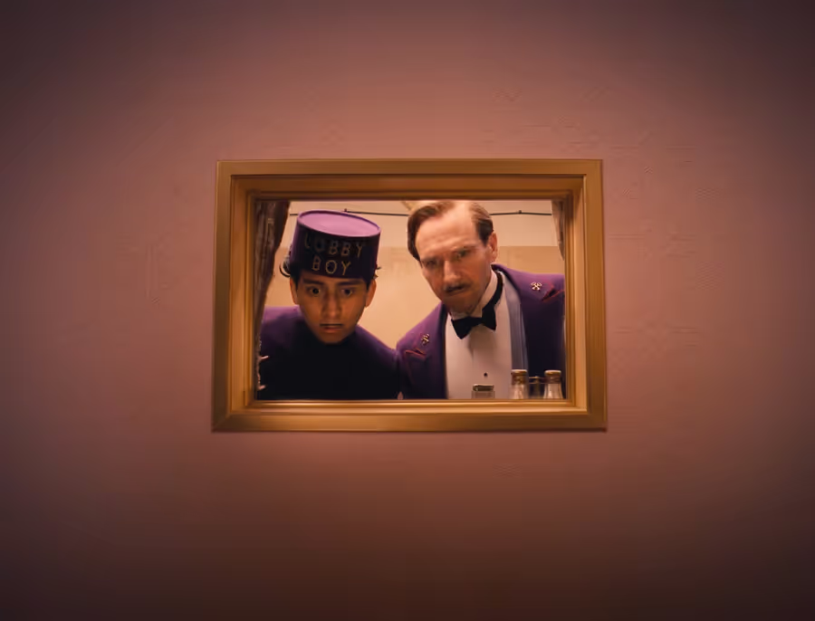
If you’re a fan of Wes Anderson’s films, you may have noticed that his unique visual style has a lot in common with good web design. Both Anderson’s films and good web design focus on simplicity, color, and creating a cohesive experience for the viewer or user.
One of the key similarities is their focus on simplicity and cleanliness. In Anderson’s films, the sets and costumes are carefully planned and arranged, with each element serving a specific purpose. This creates a clean and uncluttered look that helps to draw the viewer into the story. In web design, clean and uncluttered layouts help to guide the user’s eye and make it easy to find the information they are looking for.
Another similarity is the use of color. Anderson’s films often feature bold, vibrant colors that help to set the mood and create a unique atmosphere. In web design, color can also be used to create a certain mood or convey a message. For example, a website for a luxury brand might use elegant, muted colors, while a website for a children’s toy company might use bright, playful colors.
In addition to these visual elements, both Anderson’s films and good web design focus on creating a cohesive experience for the viewer or user. In Anderson’s films, this often involves carefully crafting the storyline and character arcs to create a sense of unity. In web design, this involves creating a clear hierarchy and structure, using consistent branding, and ensuring that all elements of the site work together to create a seamless experience.
So next time you’re watching a Wes Anderson film, take a moment to appreciate the similarities between his visual style and good web design. And if you’re a web designer, consider drawing inspiration from Anderson’s unique approach to create engaging and effective websites.
This post was heavily written by ChatGPT 🤯
I gave it a pretty detailed prompt for it to get here; but I was really surprised at just how good it was. I’m going to use this as a template to insert some of my more nuanced opinions on the topic.